Furniture hardware can quietly determine whether an interior feels considered or confused. A brass pull may warm a pale oak cabinet, while black hardware can sharpen a softer, layered room. These details are small, but they occupy the hand and the eye every day.
Understanding how to match furniture hardware with interior style requires more than copying a showroom image. It involves studying cabinet proportions, nearby lighting, wall colors, flooring, and the furniture’s actual use. In a 2026 interior, hardware may support quiet luxury, modern farmhouse warmth, Japandi restraint, or expressive maximalism. The finish should suit the room’s atmosphere, while the shape should respect the furniture’s lines. A slim bar pull feels different from a rounded knob, even when both share the same metal.
Material quality matters. Solid brass, stainless steel, zinc alloy, and painted finishes age differently under frequent touch. Experienced designers also check edge comfort, mounting strength, cleaning needs, and visual scale before choosing a product. Trends can guide decisions, but they should not overpower practical judgment. That is where many installations fail.
A perfect match is not always necessary. Sometimes, a controlled contrast creates character. A warm bronze pull against cool gray cabinetry might look unexpected, yet balanced. Still, screens can mislead, and metal samples often appear different in natural light. Test them beside the furniture.
This guide explores reliable ways to coordinate hardware with interior style in 2026. It also questions common assumptions, because good design often improves through careful reconsideration.
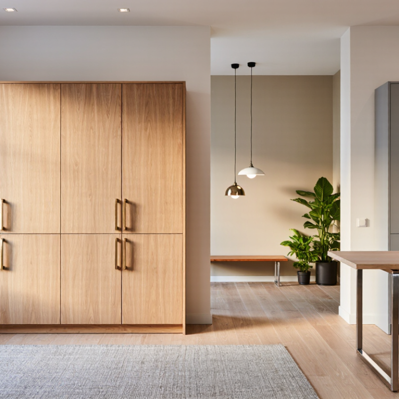
Furniture hardware is not merely a functional attachment. It controls touch, rhythm, contrast, and visual scale. A long brushed-metal pull can make a flat cabinet feel architectural. A small round knob can soften a strict, modern composition. In my projects, hardware often becomes the detail people notice after the room feels “finished.”
In 2026, designers are mixing warm metals, textured finishes, and quieter silhouettes. Match the hardware’s visual weight with the furniture’s proportions. Use slim pulls on narrow drawers. Choose broader handles for deep, heavy doors.
Matte bronze suits walnut and linen. Brushed stainless steel supports pale oak and clean stone. Finishes should repeat carefully, not mechanically. A consistent finish on every object can feel flat. Too many finishes can look accidental.
Touch also matters. A sharp-edged handle may photograph well, yet feel uncomfortable after daily use. Test it with wet or tired hands. That small check is often missed.
The National Kitchen & Bath Association’s 2025 design outlook continues to emphasize personalization and durable, livable spaces. Hardware should support both ideas.
I once selected a beautiful dark finish that showed fingerprints immediately. It looked refined for one day. Real homes are less obedient. Allow room for maintenance, aging, and personal habits when defining hardware’s role.
Matching furniture hardware begins with identifying your interior style, not choosing a finish. Study the room’s visual language first. Is it calm and minimal, warm and rustic, refined and classic, or expressive and eclectic? Notice straight cabinet lines, rounded furniture edges, visible wood grain, wall texture, and the amount of decoration. A quiet modern room often suits slim pulls with clean geometry. A traditional room may welcome shaped knobs, aged finishes, and more visual weight. Look closely.
Color temperature also matters. Cool gray walls can make polished metal feel sharper, while warm oak softens bronze or muted black hardware. Measure cabinet proportions before deciding. Small drawers usually need compact knobs, while wide doors may require longer pulls for balance and comfortable use. In real projects, I have seen attractive hardware look wrong because its scale ignored the furniture. That mistake is easy to make. A style diagnosis can also be imperfect, especially in layered homes combining vintage and contemporary pieces.
Tips: Collect three hardware samples and view them in morning and evening light. Place each sample on the actual cabinet, not only on a screen. Check how the finish feels beside flooring, lighting, and nearby textiles. Trust repeated visual evidence, but question your first impression. Function matters too; slippery knobs and awkward pulls quickly weaken a beautiful design. Choose hardware that supports the room’s character without making every detail compete.
For modern interiors, try slim bar pulls in brushed stainless steel or soft black. Their straight edges suit flat-front drawers and pale oak.
Traditional rooms benefit from aged brass, bronze, or porcelain knobs. These materials add warmth beside walnut, painted timber, and visible joinery.
Transitional spaces can handle both, but the proportions must stay calm.
Rounded knobs soften heavy furniture. Square pulls create a sharper, architectural feeling. The 2024 NKBA Design Trends report highlights warmer palettes and mixed materials in residential design. That supports using brass with stone, wood, or muted green cabinetry.
Still, matching every metal can make a room feel staged. A slightly imperfect combination often feels more lived-in. I sometimes regret choosing a fashionable finish too quickly; fingerprints and changing daylight reveal weaknesses later.
Tips: Test samples on the actual furniture. View them in morning and evening light. Keep pull lengths visually balanced with drawer width. Use one dominant finish and one quiet accent. For children’s rooms, avoid sharp projections. Check the grip before trusting appearance. A beautiful handle can still feel wrong.
Hardware should connect spaces without making every room look identical. I usually begin with one finish family, then vary shapes and sizes. For example, brushed metal pulls can link kitchen cabinets, bedroom drawers, and a hallway console. A softer edge suits bedrooms, while a firm bar works better in busy kitchens. Keep proportions practical. Oversized handles can overwhelm a narrow door.
Look at fixtures, too. Match cabinet knobs with tap details, lighting accents, or towel bars when possible. The relationship should feel intentional, not copied. In a warm interior, muted bronze or aged brass may support timber and stone. In a clean contemporary room, satin steel can create a quieter line. Always test physical samples beside flooring, paint, and natural light. Screens often distort color.
Small details matter.
From installation work, I have learned that consistency is not absolute sameness. A bathroom needs finishes that tolerate moisture and frequent cleaning. A wardrobe may need a lighter grip for daily use. I once selected a beautiful dark finish that showed fingerprints immediately. It looked refined in the showroom, but inconvenient at home. That mistake changed my process. I now check touch, glare, edge comfort, and cleaning needs before approving a complete set. There is still room for judgment. A slightly different pull can make a room feel more personal, although too many changes quickly become visual noise.
Furniture hardware should support the room, not merely decorate it. Start by measuring the furniture before choosing a finish or shape. A wide cabinet door may need a longer pull for comfortable reach and visual balance. On a narrow nightstand, an oversized handle can feel heavy and awkward. Use the existing lines as evidence. Scale is a practical decision.
Function deserves equal attention. Test how the drawer opens with one hand, especially near a wall or beside a bed. Rounded edges suit frequent contact, while textured surfaces can improve grip with wet or tired hands. Check screw length, mounting clearance, and resistance to daily cleaning. These small checks prevent loose fittings and damaged fronts later. In kitchens, bathrooms, and entryways, moisture and repeated use matter more than short-lived trends. Ask a qualified installer to confirm compatibility when construction is unfamiliar.
Long-term consistency comes from repeating a restrained detail. Match the hardware’s geometry with nearby lighting, hinges, or furniture legs, rather than copying every finish. One consistent metal tone can connect separate rooms, but exact uniformity is not always necessary. Warm wood may tolerate a darker pull; pale painted furniture may need quieter contrast. I have sometimes chosen attractive hardware that looked wrong after the room became busy. That mistake taught me to view samples in daylight and at night. Leave room for doubt. Live with a paper template for a day before drilling.
Hardware controls touch, rhythm, contrast, and visual scale. A long metal pull can make a flat cabinet feel architectural.
Use slim pulls on narrow drawers. Choose broader handles for deep, heavy doors. The hardware should not look visually lost.
Brushed stainless steel and soft black suit flat fronts, pale oak, and clean stone. Their quiet surfaces support simple forms.
Aged brass, bronze, and porcelain add warmth. They pair naturally with walnut, painted timber, and visible joinery.
Yes, but choose one dominant finish and one quiet accent. Matching every metal can feel staged. Too many finishes look accidental.
Very important. Rounded knobs soften heavy furniture, while square pulls create a sharper architectural effect.
Test the sample on the actual furniture. View it in morning and evening light. Check the grip with wet or tired hands.
Consider fingerprints, cleaning, aging, and daily habits. I once chose a beautiful dark finish that looked poor after one day.
Avoid sharp projections and uncomfortable edges. Choose rounded forms with a secure grip. Appearance is not enough.
Not exactly. Repeat a finish carefully, while allowing small differences. A slightly imperfect combination may feel more lived-in.
Learning how to match furniture hardware with interior style begins with recognizing that knobs, pulls, hinges, and handles are both functional details and visual accents. Start by identifying the room’s dominant style, whether it is minimalist, traditional, industrial, contemporary, or eclectic, and note its key characteristics such as clean lines, ornamentation, warmth, or contrast. Then select hardware materials, finishes, and shapes that reinforce these qualities. Matte black may add definition to modern spaces, while brushed metal, warm brass tones, or softer rounded forms can support more welcoming and classic interiors.
Consistency is equally important. Coordinate hardware across rooms, cabinetry, furniture, lighting, and plumbing fixtures without making every element identical. Consider the scale of each piece, how comfortably it functions, and whether its finish will remain attractive over time. A successful choice balances appearance, durability, usability, and long-term design harmony, allowing hardware to complement the interior rather than compete with it.

Refa Tools